Quick summary
Learn how to choose the best paper, finish, and design for visiting card printing. Explore matte, gloss, spot UV, foil, textured paper, QR codes, and print-ready tips.
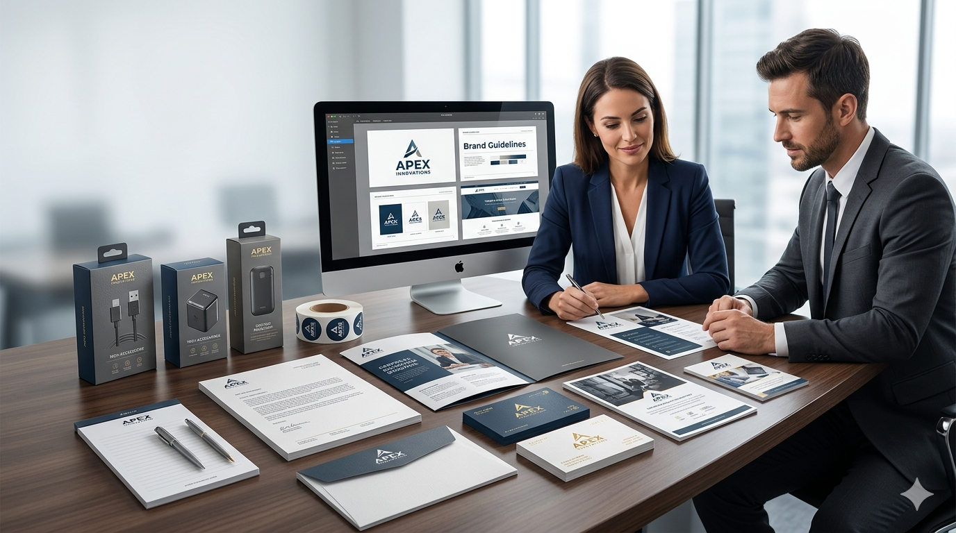
A visiting card is more than a small piece of printed paper. It represents your brand, your profession, and the quality of your business. When someone receives your card, they quickly form an opinion about your professionalism. That is why choosing the right paper, finish, and design is important.
A good visiting card should be easy to read, comfortable to hold, and suitable for your industry. Whether you are a business owner, doctor, consultant, designer, real estate professional, or startup founder, the right visiting card printing choice can make your first impression stronger.
At Sanavi Print Point, we help customers create visiting cards that look clean, premium, and practical for daily business use. This guide will help you understand the most important things to consider before printing your next visiting card.
Why Visiting Card Printing Still Matters
Even in the digital age, visiting cards are still useful. They are simple, direct, and easy to share during meetings, exhibitions, client visits, store interactions, and networking events.
A professionally printed visiting card helps you:
- introduce your brand quickly
- share contact details easily
- create a polished first impression
- make your business look more reliable
- support your overall brand identity
A poorly printed card can make even a good design look weak. On the other hand, a well-printed card with the right paper and finish can instantly feel premium.
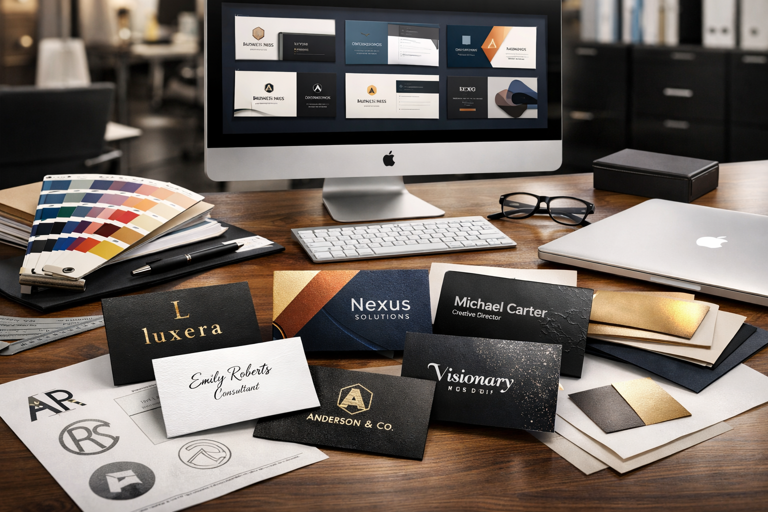
Choosing the Right Visiting Card Paper
Paper is one of the first things people notice when they hold your card. The design may attract attention, but the paper quality creates the feeling of value.
250 GSM Art Card
A 250 GSM art card is a practical and budget-friendly option for standard visiting card printing. It is suitable for businesses that need cards in regular quantity and want a clean professional look without a very high cost.
This option works well for:
- small businesses
- sales teams
- retail counters
- general service providers
- promotional use
It is simple, useful, and suitable for everyday business communication.
300 GSM and 350 GSM Cards
If you want a stronger and more premium feel, 300 GSM or 350 GSM card stock is a better choice. These cards feel thicker and more durable than basic cards.
They are ideal for:
- consultants
- corporate professionals
- doctors
- architects
- real estate professionals
- premium service providers
A thicker card gives a better hand feel and creates a stronger impression when you share it with a client.
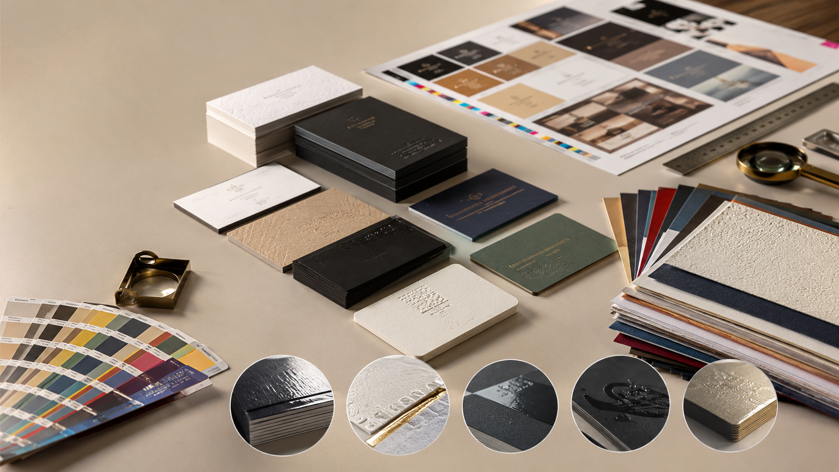
Textured Paper Cards
Textured paper gives your visiting card a special feel. It can add elegance without making the design too loud. Linen, ivory, canvas, and other textured papers are often used for premium visiting cards.
Textured cards work well for:
- designers
- boutique businesses
- wedding planners
- interior professionals
- luxury service brands
If your business depends on style and presentation, textured paper can be a smart choice.
Non Tearable Visiting Cards
Non tearable visiting cards are made with durable synthetic material. They are water-resistant and stronger than regular paper cards. These cards are useful when durability is important.
They are suitable for:
- field sales teams
- outdoor service providers
- industrial businesses
- event teams
- businesses where cards are handled frequently
Non tearable cards are practical and long-lasting, especially for people who meet customers outside office environments.
Popular Visiting Card Finishes
The finish of your card affects both appearance and touch. A good finish can make even a simple design look more professional.
Matte Finish
Matte finish is one of the most popular options for modern visiting card printing. It gives the card a smooth and elegant look without shine. It also reduces glare, which makes the text easier to read.
Matte finish is best for:
- corporate professionals
- consultants
- premium brands
- doctors
- lawyers
- service-based businesses
If you want a clean and professional visiting card, matte finish is a safe and stylish choice.
Gloss Finish
Gloss finish gives the card a shiny and bright appearance. It makes colors look more vibrant and can work well when the card has product photos, colorful branding, or bold graphics.
Gloss cards are suitable for:
- retail brands
- salons
- restaurants
- event businesses
- creative promotions
Gloss finish can look attractive, but it should be used carefully. If the design has too much shine and too many colors, the card may look less premium.
Spot UV Finish
Spot UV is used to highlight selected parts of the card with a glossy effect. Usually, the logo, brand name, or small design pattern is highlighted while the rest of the card remains matte.
Spot UV is ideal when you want a premium visiting card without making it flashy.
Good areas for spot UV include:
- logo
- company name
- icon
- design pattern
- selected text
This finish adds depth and gives the card a more luxurious appearance.
Foil Finish
Foil finish is used to add metallic shine to selected elements. Gold foil, silver foil, rose gold foil, and other metallic effects can make a visiting card look premium.
Foil works best for:
- luxury brands
- interior designers
- jewelry businesses
- premium salons
- fashion brands
- boutique consultants
The important thing is balance. A small amount of foil can look elegant. Too much foil can make the card look heavy.
Velvet Finish
Velvet finish gives a soft touch and premium feel. It is often used for luxury business cards where the customer wants something different from regular matte or gloss finish.
Velvet cards are a good option when you want your visiting card to feel smooth, rich, and memorable.
Design Tips for a Professional Visiting Card
A visiting card should look good, but it should also be easy to read. The best visiting card design is clear, balanced, and useful.
Keep the Layout Clean
Do not try to add too much information. A crowded card becomes difficult to read and looks less professional.
Include only the most important details:
- name
- company name
- designation
- phone number
- email address
- website
- address if required
- QR code if useful
If you need to add more information, use a double sided card instead of forcing everything on one side.
Use Readable Fonts
Font choice plays an important role in visiting card design. Avoid very decorative fonts for contact details. They may look stylish on screen but can become hard to read after printing.
Use clean fonts for name, mobile number, email, address, and website. Your card should be readable at a quick glance.
Maintain Brand Colors
Your visiting card should match your brand identity. Use your company colors, logo style, and brand tone consistently. This helps people connect your card with your website, packaging, signage, and other marketing materials.
For professional branding and print support, you can visit Sanavi Print Point.
Add a QR Code Smartly
QR code visiting cards are becoming popular because they connect offline networking with digital action. A QR code can take people to your website, WhatsApp, Google Maps location, portfolio, or contact save page.
Before printing, always test the QR code from different phones. Also make sure it is not too small.
Leave Enough White Space
White space does not mean empty design. It gives your card breathing room and makes the information easier to read. A clean layout with good spacing often looks more premium than a card filled with too many elements.
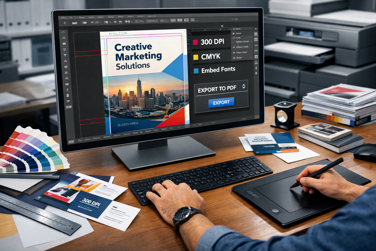
Use Proper Print File Setup
A good design must also be prepared correctly for printing. Bleed, safe margin, image quality, and color setup all matter.
For print-ready files, Adobe explains how bleed and printer marks help during professional printing workflows: Adobe bleed and printer marks guide.
Canva also provides helpful information about margins, bleed, and crop marks for print files: Canva margins and bleed guide.
For color accuracy, it is useful to understand the difference between RGB and CMYK printing. HP explains this in a simple way here: HP CMYK vs RGB printing guide.
Single Side or Double Side Visiting Card
Both options can work well depending on your requirement.
Single Side Card
A single side card is simple and cost-effective. It is suitable when you have limited information and want a clean card for regular use.
Double Side Card
A double side card gives more space for branding and information. You can use the front side for your name and contact details, and the back side for services, QR code, tagline, or brand pattern.
For most professionals, a double side visiting card gives a more complete and polished result.
Common Visiting Card Printing Mistakes to Avoid
Many visiting cards look average because of small mistakes. Before final printing, check these points carefully:
- low quality logo
- too much text
- wrong font size
- poor color contrast
- no safe margin
- missing bleed
- incorrect phone number
- unreadable QR code
- poor paper selection
- overcrowded layout
A visiting card is a small format, so every detail matters. Even one mistake can reduce the overall impact.
How to Choose the Best Visiting Card for Your Business
The best visiting card depends on your profession, budget, and brand image.
If you want a simple and affordable card, choose a standard art card with clean design. If you want a premium impression, choose thicker paper with matte finish, spot UV, foil, or textured stock. If you want durability, non tearable visiting cards can be a better choice.
What impression do I want to create?
Your card can look professional, premium, creative, bold, or minimal. Choose the style that matches your business.
Who will receive my card?
A card for corporate clients may need a formal look. A card for a creative brand can be more stylish and expressive.
How often will I share the card?
If you distribute cards frequently, cost-effective printing may be important. If you share fewer cards with high-value clients, premium finishing may be worth it.
Final Thoughts
Visiting card printing is not only about selecting a design and placing an order. The paper, finish, layout, font, color, and print quality all work together to create the final impression.
A good visiting card should feel professional in hand, look clean at first glance, and make your contact details easy to remember. Whether you choose matte finish, gloss finish, spot UV, foil, textured paper, or non tearable stock, the goal should always be the same: clear communication with strong branding.
If you are planning to print visiting cards for your business, team, or personal brand, choose a design and finish that truly represents your work.
For visiting card printing and other professional print solutions, visit https://www.sanaviprintpoint.com.
FAQ
Which paper is best for visiting card printing?
For standard use, 250 GSM art card is a practical option. For a more premium feel, 300 GSM or 350 GSM card stock is better. Textured paper and velvet finish cards are suitable for luxury branding.
Which finish is best for professional visiting cards?
Matte finish is a popular choice for professional visiting cards because it looks clean, elegant, and easy to read. Spot UV and foil can be added for a premium look.
Should I choose single side or double side visiting cards?
Double side visiting cards are better if you need space for a QR code, services, address, or branding. Single side cards are suitable for simple and budget-friendly requirements.
Can I add a QR code to my visiting card?
Yes, you can add a QR code to your visiting card. It can link to your website, WhatsApp, portfolio, location, or contact page. Always test the QR code before printing.
What makes a visiting card look premium?
A premium visiting card usually has good paper thickness, clean layout, readable fonts, proper spacing, and a quality finish such as matte lamination, spot UV, foil, velvet, or textured stock.
Why does print file setup matter for visiting cards?
Print file setup matters because small errors like missing bleed, low resolution logo, or text too close to the edge can affect the final printed card. Proper file setup helps achieve cleaner and more accurate results.