Quick summary
Discover how thoughtful label printing can strengthen product branding, improve shelf appeal, communicate essential information, and create a more consistent customer experience.
When customers compare products on a shelf, counter, display stand, or online catalogue, the label often becomes one of the first details they notice. It identifies the product, carries important information, and helps communicate the personality of the brand. For many packaged products, the label is not simply an information sticker. It is a practical branding surface that connects design, print quality, material choice, and product presentation.
Good label printing can help a product look more organized, recognizable, and appropriate for its market. It can also make important details easier to find and create consistency across different products or variants. The strongest results come from planning the label around the real package, the customer, and the conditions in which the product will be handled.
Why Product Labels Matter for Branding
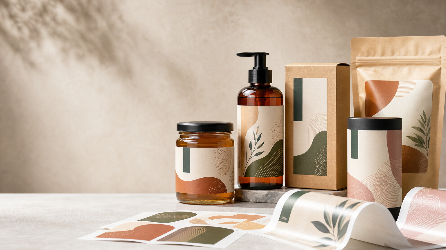
A brand identity may begin with a logo, colour palette, typography, and visual style, but customers experience that identity through real touchpoints. A product label is one of those touchpoints. It brings the visual brand directly onto a bottle, jar, box, pouch, container, or other package.
When labels follow a consistent visual system, customers can more easily connect different products with the same business. Consistency is particularly useful when a range includes several flavours, sizes, fragrances, models, or other variants. Each item can have its own identifying details while still looking like part of one family.
1. Labels Help Products Become Recognizable
Recognition is important in a crowded product environment. Customers should be able to distinguish a product without needing to study every detail. A clear combination of colour, layout, typography, imagery, and shape can create a visual signature that becomes familiar over repeated encounters.
This does not mean every label needs to be bold or highly decorative. A minimalist label can be just as distinctive when its spacing, type, material, and colour choices are intentional. The objective is to create a design that fits the product and remains identifiable alongside competing items.
2. Shelf Appeal Begins with Clear Visual Hierarchy
Shelf appeal is not only about making a label attractive. It is also about helping the customer understand the product quickly. The most important information should receive the strongest visual emphasis, while supporting details should remain easy to locate without creating clutter.
A useful hierarchy might prioritize the product name or type, followed by a key variant, category, or relevant descriptor. Secondary information can then be arranged in a quieter supporting area. When too many elements compete for attention, the label can become difficult to scan.
Spacing is an important design tool. Leaving appropriate room around important elements can make a small label feel more refined and improve readability. Crowding every available area with messages, icons, borders, and effects often reduces impact rather than increasing it.
3. Print Quality Influences the Brand Impression
A carefully designed label still depends on accurate production. Blurry images, weak small text, inconsistent trimming, poor alignment, or unsuitable artwork can make a product look less polished. Sharp details and clean reproduction help the physical label reflect the care put into the design.
Artwork should therefore be prepared for the intended print process and final label size. Images need suitable resolution, fine lines and small text need to remain practical, and important elements should stay within safe areas. Bleed should be included where the design runs to the edge, according to the production specifications for the job.
It is also important to remember that printed colour can look different from colour on a phone or computer screen. Material, surface finish, ink, lighting, and production method can all affect the final appearance. Where colour consistency is important, work from established brand specifications and review appropriate proofs or samples when practical.
4. Label Material Should Match the Product Environment
The visual design is only one part of label planning. The material and adhesive should suit the surface and the conditions the product may encounter. A label for a dry carton has different practical requirements from one used on a curved bottle, refrigerated container, cosmetic jar, or product that may be handled frequently.
Consider the package material, surface texture, shape, temperature, moisture exposure, storage, transport, and expected product life. A beautiful label that lifts at the edge, wrinkles on a curve, or becomes difficult to read during normal use does not support a strong brand experience.
Testing a sample on the actual package can be valuable, particularly when the container has unusual curves, textures, coatings, or environmental requirements. The physical fit should be checked before committing to a larger production quantity.
5. Finishes Can Support Product Positioning
The surface character of a label can influence how customers perceive the product. Matte, gloss, textured, metallic, transparent, or other suitable label treatments can create different visual and tactile effects. Additional finishing may also be considered where it supports the design and production method.
Finishing should be purposeful. A premium-looking effect is most successful when it reinforces the brand concept rather than competing with it. Too many decorative treatments can make the design busy and may distract from the product information.
For an understated brand, a clean material and restrained finish may be more suitable than multiple special effects. For a product intended to create a more expressive impression, a carefully chosen finish can provide a useful focal point. The right choice depends on the product category, audience, package, and overall brand direction.
6. Labels Organize Essential Product Information
A product label often needs to do more than attract attention. Depending on the product and applicable requirements, it may need to carry ingredients, quantity, usage instructions, warnings, batch details, dates, contact information, barcodes, regulatory information, or other declarations.
These requirements should be identified before the visual design is finalized. Leaving mandatory information until the end can force important details into spaces that were not planned for them, resulting in small text or a crowded layout.
Businesses should verify the specific labelling requirements that apply to their product and market. Designers and printers can help organize the available space, but product owners should ensure that required information is complete and accurate before approving artwork.
7. A Consistent Label System Helps Product Ranges Grow
When a business has several products, designing every label independently can lead to inconsistency. A better approach is to create a flexible label system with common rules for typography, brand placement, information hierarchy, colours, and spacing.
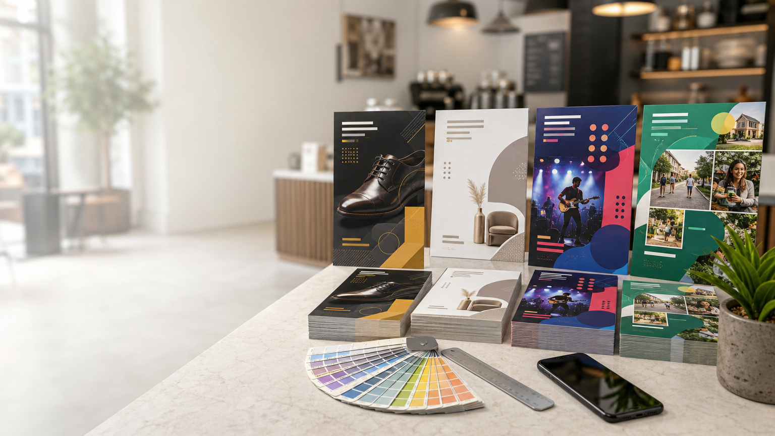
Variants can then be differentiated through a controlled element such as a colour band, illustration, product photograph, pattern, or clearly positioned descriptor. This makes individual products easier to distinguish while preserving family resemblance.
Planning for future variants can also reduce redesign work. A layout that works only for one short product name may create problems when a later variant needs more text. Flexible templates should accommodate realistic differences without losing balance.
8. Label Shape and Size Affect Shelf Presence
Label dimensions should be based on the actual package rather than chosen only from a screen mockup. The available printable area, container curves, seams, caps, handles, and viewing angle all affect how the label appears in use.
A front label may need to communicate the key identity quickly, while a back or secondary label can carry detailed information. In some cases, a wraparound format can provide additional space, but the design should consider where the customer naturally holds and views the product.
Before finalizing dimensions, create a physical mockup at actual size. Place it on the intended package and view it from normal customer distance. This simple check can reveal whether text is too small, key information disappears around a curve, or the overall proportion feels wrong.
9. Photography and Graphics Should Support the Product
Images, illustrations, patterns, and graphic elements can make a label more engaging, but they should help explain or position the product. Decorative visuals that do not relate to the product can create confusion or make the design feel generic.
Use suitable source artwork and avoid low-resolution images copied from websites or messaging apps. Small label dimensions can make image quality seem less important, but poor source files may still produce visible softness or artifacts in print.
Graphic style should also remain consistent with other brand materials. When packaging, labels, brochures, visiting cards, signage, and digital communication share a recognizable visual language, the overall brand feels more coordinated.
10. Labels Can Connect Physical Products with Digital Information
Where appropriate, a QR code can direct customers to additional product information, instructions, a website, a catalogue, or another useful digital destination. This can help keep the physical label focused while providing access to more detailed content.
QR codes should be tested from the final artwork and at the intended printed size. Adequate contrast and clear space around the code are important for reliable scanning. Essential product information should not be hidden exclusively behind a digital link when it needs to remain directly visible on the package.
Practical Label Design and Printing Checklist
- Confirm the package: Measure the real container, box, pouch, or surface before finalizing label dimensions.
- Define the hierarchy: Decide what customers should notice first, second, and third.
- Keep branding consistent: Follow established colours, typography, and visual style across the product range.
- Plan required information: Identify applicable product and regulatory details before completing the layout.
- Choose suitable material: Consider surface type, handling, moisture, temperature, and storage conditions.
- Prepare print-ready artwork: Use correct dimensions, suitable resolution, bleed, safe margins, and production specifications.
- Check readability: Review small text and contrast at actual printed size.
- Proof every detail: Verify names, quantities, dates, contact details, barcodes, and other critical information.
- Test the physical fit: Apply a sample or mockup to the actual package where practical.
- Review variants together: Make sure different products are easy to distinguish while remaining visually related.
Common Label Printing Mistakes to Avoid
One common mistake is creating the label before the package dimensions are confirmed. Even a small size change can affect line breaks, hierarchy, and how the label sits on a curved surface. Another is adding too much information to the front, leaving customers unsure where to look.
Businesses should also avoid relying entirely on screen previews for colour and scale. Review artwork at actual size and consider the effect of the chosen material. Very thin lines, tiny text, low-contrast combinations, and detailed images may behave differently in print than they do when enlarged on a monitor.
Finally, do not overlook proofreading. A label can remain attached to many units of product, so an incorrect phone number, spelling error, wrong quantity, or outdated detail can become difficult to correct after production. Use a deliberate approval process before printing.
Conclusion
Label printing plays an important role in both product branding and shelf appeal because the label combines identity, information, and physical presentation in one compact space. A strong label helps customers recognize the product, understand what they are looking at, and connect it with the wider brand.
The most effective labels are not necessarily the most decorative. They are the ones that balance clear hierarchy, accurate information, suitable materials, thoughtful finishing, consistent branding, and reliable print preparation. By designing for the actual package and the real customer experience, businesses can turn a practical label into a valuable part of how the product is presented and remembered.