Quick summary
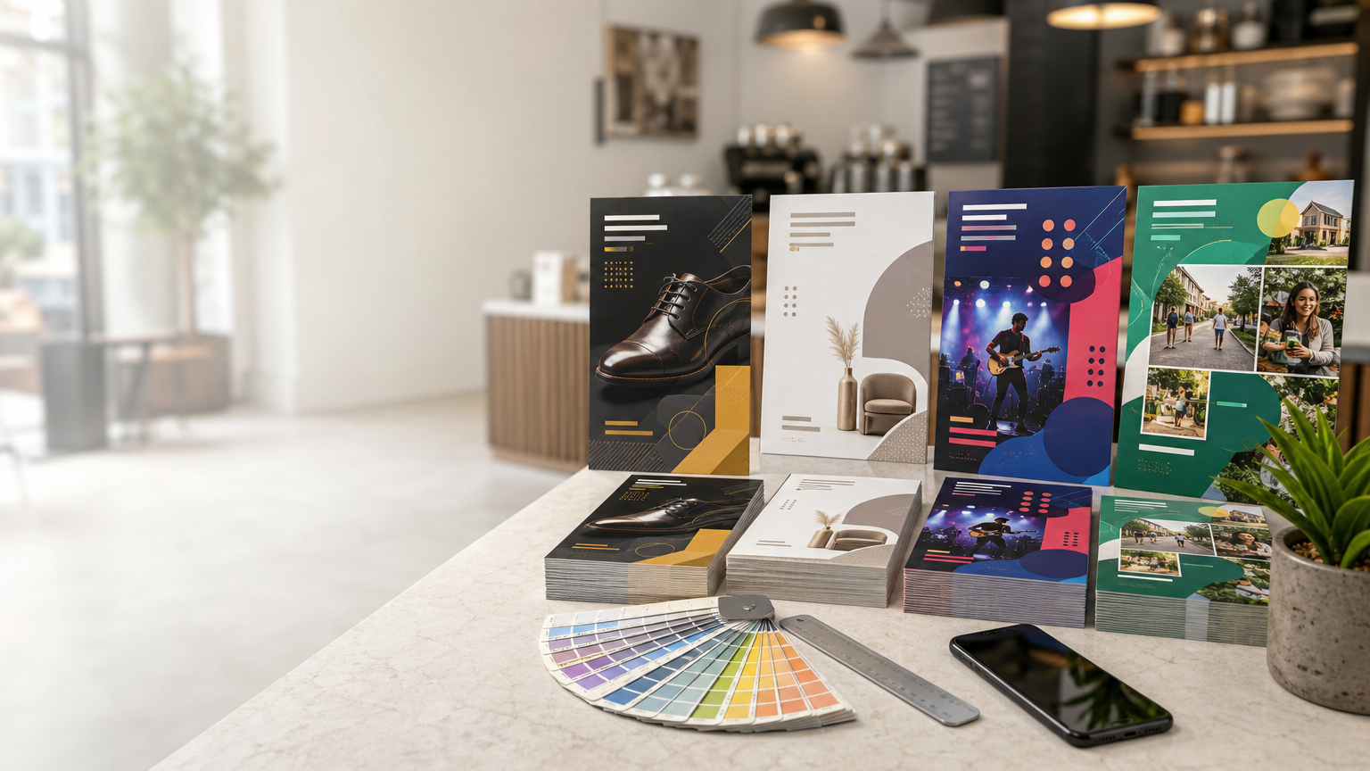
Explore practical flyer design ideas for local business promotion, from bold offers and product-led layouts to QR-driven campaigns, events, seasonal promotions, and neighborhood marketing.
A flyer can be one of the most flexible tools in a local business marketing kit. It can introduce a new service, promote a seasonal offer, announce an event, support a store opening, highlight a product range, or simply help nearby customers remember that a business exists. The challenge is not whether flyers can look attractive. It is designing them so the message is understood quickly and the reader knows what to do next.
Creative flyer design does not require filling every corner with graphics. In many cases, the strongest ideas are built around one clear message, a relevant visual, a recognizable brand style, and an obvious response path. The following ideas can help local businesses create flyers that feel fresh while remaining practical for real-world promotion.
Start with the Promotion Goal, Not the Decoration
Before choosing colours, photographs, or typography, define the purpose of the flyer. Is it meant to generate enquiries, bring customers to a physical location, promote an event, introduce a service, or encourage repeat business? A flyer with one primary objective is easier to design and easier to understand.
Once the goal is clear, decide what information the reader genuinely needs. A promotional flyer may require a headline, short supporting message, offer details, contact method, and call to action. A service flyer may need a little more explanation. An event flyer needs date, time, venue, and participation details. Design should organize this information rather than compete with it.
1. Build the Flyer Around One Bold Offer
For a sale, introductory service, limited campaign, or special package, make the central offer the visual focus. Use a short headline, generous space around it, and one strong supporting image. Secondary details can sit below in a smaller hierarchy.
This approach works because people often see flyers while walking, browsing a counter, or sorting through other materials. They may give the piece only a few seconds at first. A clear focal point helps them decide whether the message is relevant.
2. Use a Product-Hero Layout
Retailers, food businesses, salons, gift sellers, and product-based businesses can make the product itself the hero. Use one strong photograph or a carefully arranged group of related products rather than many small images competing for attention.
Allow the image to occupy a substantial part of the layout, then place the headline and key information in a clean area beside or above it. Good photography, realistic colour, and uncluttered composition can communicate quality before the reader reaches the details.
3. Create a Before-and-After Story
Businesses whose services create a visible transformation can use a before-and-after concept. Suitable examples may include cleaning, repair, renovation, grooming, beauty, restoration, organization, or other services where the result can be shown responsibly.
Keep both images similar in scale and perspective so the comparison is easy to understand. Avoid exaggerated editing that could misrepresent the service. A simple split composition with a concise explanation can be more convincing than a long list of claims.
4. Design a Neighborhood-Focused Flyer
Local businesses can make a flyer feel more relevant by visually reflecting the community they serve. This might include an appropriate streetscape, familiar type of storefront, neighborhood lifestyle imagery, or a map-inspired graphic that shows the service area without overcrowding the design.
The aim is to communicate local relevance, not to fill the flyer with location details. Combine the visual cue with a clear service message and accurate contact information. If a map is used, ensure roads, landmarks, and directions are correct before printing.
5. Use a Clean Service-Menu Format
When a business offers several related services, a structured service-menu flyer can work better than a single promotional headline. Divide the page into a small number of clear groups, using consistent headings, icons, or simple photographs.
This format can suit salons, clinics, repair businesses, training providers, professional services, and home-service companies. Keep descriptions short. If pricing changes frequently, consider directing readers to an enquiry channel or current digital source rather than printing information likely to become outdated quickly.
6. Connect Print and Digital with a QR-Led Layout
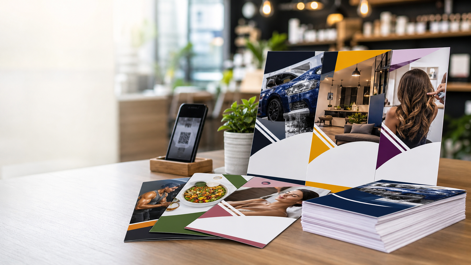
A flyer can act as the physical starting point of a digital journey. A QR code may lead to a relevant landing page, enquiry form, menu, portfolio, booking page, or other appropriate destination. The code should be given enough clear space and paired with a short instruction explaining why the reader should scan it.
Do not make the QR code the only response option when another practical contact method is useful. Test the final code from the actual print artwork at realistic size before production, and verify that the destination page works well on a phone.
7. Try a Minimal Premium Style
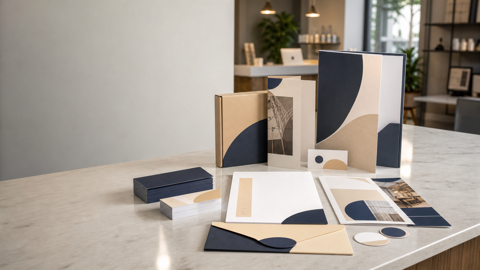
Not every local promotion needs bright colours and large bursts. A restrained flyer can stand out precisely because it is calm. Use a limited colour palette, strong typography, generous negative space, and one carefully selected image or graphic element.
This style can suit professional services, premium products, studios, consultants, wellness businesses, property-related services, and brands with a refined identity. Minimal design still needs a strong hierarchy; empty space should make the important information easier to notice.
8. Create an Event-First Flyer
For workshops, openings, demonstrations, exhibitions, classes, community activities, or in-store events, make the event itself the central story. The event name or purpose should lead, followed immediately by the date, time, and venue information.
Use imagery that communicates what attendees can expect. A workshop flyer might show hands-on activity, while a store opening could feature the space or relevant products. Avoid decorative elements that make essential event details difficult to locate.
9. Use Seasonal Visual Cues Without Losing the Brand
Seasonal campaigns can feel timely when the design uses relevant colours, materials, photography, or motifs. However, the flyer should still look like it belongs to the business. Keep core brand elements consistent while adding seasonal accents around them.
This is more sustainable for brand recognition than completely changing the visual identity for every festival or season. It also makes it easier to create a repeatable campaign system for future promotions.
10. Turn Customer Questions into the Flyer Concept
A useful flyer idea can come directly from questions customers ask repeatedly. Instead of leading with a generic sales message, build the flyer around a practical question such as how a service works, which option is suitable, what to bring to an appointment, or how to request a quotation.
This educational approach can reduce uncertainty while promoting the business naturally. Keep the answer concise and direct readers to the appropriate contact or information source for more detail.
11. Use Tear-Off or Takeaway Information Thoughtfully
In suitable locations, a notice-style flyer can include simple takeaway contact slips or detachable information. This format may be useful for community boards, classes, rentals, services, or local notices where people may not want to photograph the entire page.
Make sure the detachable portion contains only the essential response information. Check whether the placement location permits this format and whether the finished piece can be trimmed or perforated appropriately for its intended use.
12. Create a Mini Brochure on a Single Sheet
When more explanation is necessary but a folded brochure is not required, a well-structured single-sheet flyer can behave like a mini brochure. Use distinct zones for the problem, solution, key services or products, supporting visual, and next step.
The sections should feel connected rather than like separate advertisements. Consistent alignment, spacing, colours, and image treatment help the page remain organized even when it contains more information.
Make Typography Do More of the Design Work
Typography is not only for displaying words. Scale, weight, spacing, and alignment create visual hierarchy. A strong headline paired with a readable supporting typeface can give a flyer personality without adding unnecessary graphics.
Avoid using too many typefaces or decorative fonts. Small body text should remain easy to read in print. Always review the design at its actual printed size, because text that looks comfortable when zoomed in on a monitor may be too small on paper.
Choose Images That Support the Message
Use photographs and illustrations because they communicate something useful, not simply because a space looks empty. Product images should be sharp and accurately represent the item. Service imagery should feel relevant to the actual customer experience. Lifestyle photography should match the audience and tone of the business.
Low-resolution web images and screenshots can reproduce poorly in print. Whenever possible, work from suitable high-resolution source files and crop them intentionally for the final layout.
Plan Colour for Print, Not Only for the Screen
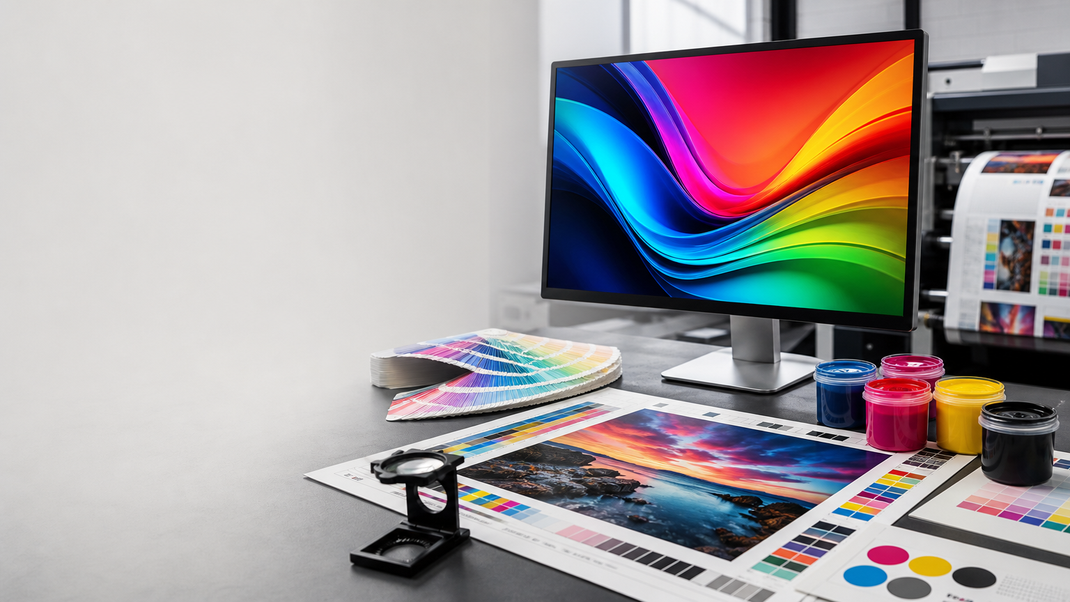
Bright screen colours can change when reproduced in print because screens emit light while paper reflects it. Design with the intended printing process and material in mind. If brand colours are important, use established print values or follow the specifications provided for the job.
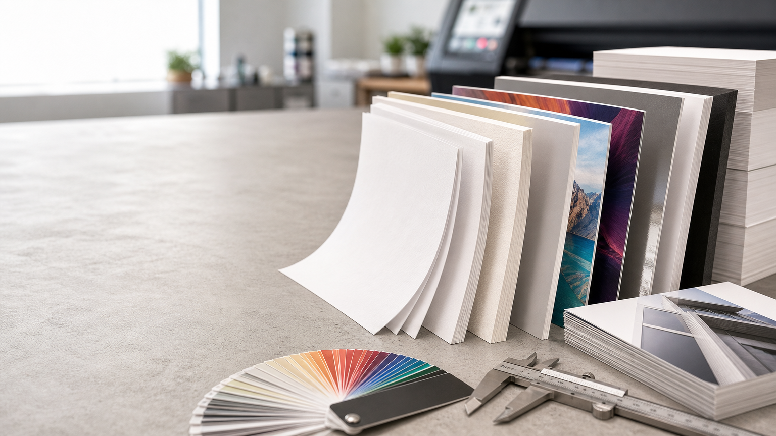
Paper also affects appearance. Coated, uncoated, matte, glossy, coloured, and textured materials can change perceived colour and contrast. The creative concept should therefore consider the physical material as part of the design.
Give the Call to Action Its Own Space
A flyer can look excellent and still underperform if readers cannot tell what to do. Give the call to action a distinct area and use direct language. Depending on the campaign, the next step might be to call, message, visit, scan, enquire, attend, or request more information.
Before printing, verify every phone number, URL, QR code, date, address, and offer condition. These details are functional parts of the design and deserve the same attention as the visuals.
Practical Pre-Print Checklist
- One primary goal: The flyer should have a clear reason to exist.
- Strong hierarchy: Headline, key message, details, and response path should be easy to scan.
- Readable type: Review text at actual print size.
- Quality imagery: Use suitable source images rather than screenshots or low-resolution graphics.
- Brand consistency: Keep colours, typography, and visual tone connected to other business materials.
- Accurate details: Proofread contact information, dates, locations, prices, and conditions where applicable.
- Print-ready setup: Check bleed, margins, colour mode, image resolution, and export requirements for the production workflow.
- Test response tools: Scan QR codes and open links before approval.
Final Thoughts
Creative flyer design is most effective when creativity supports communication. A bold offer, product-led image, local theme, service menu, event concept, seasonal treatment, or QR-driven layout can all work when the idea matches the campaign goal and audience.
Start with the message, build a clear visual hierarchy, choose images and materials deliberately, and make the next action obvious. For local business promotion, a flyer does not need to say everything. It needs to attract the right person's attention, communicate one useful idea clearly, and provide an easy path to the next step.