Quick summary
A well-designed visiting card can turn a brief introduction into a memorable brand touchpoint. Learn how layout, paper, print quality, finishing, and practical information work together to create a strong professional first impression.
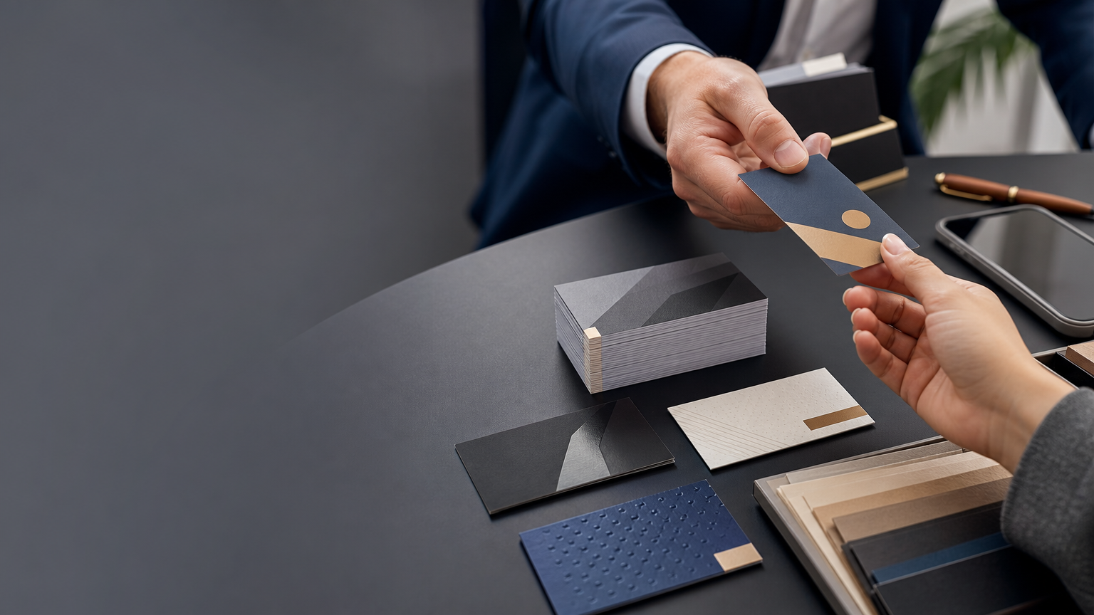
A first impression is often formed in a few seconds. During a meeting, sales visit, exhibition, consultation, networking event, or local business interaction, a visiting card gives your introduction a physical form that the other person can keep.
Digital contact sharing is useful, but a printed card serves a different purpose. It presents essential details in a compact format and gives the recipient a tangible reminder of the person and business they met. A strong visiting card does not need to be complicated. Clear information, consistent branding, suitable material, good print quality, and a practical layout can make a small card a valuable professional touchpoint.
Why Visiting Cards Still Matter
A visiting card is designed for person-to-person exchange. A website may contain detailed information and a brochure may explain a company at length, but a card is immediate. It can be handed over at the exact moment a conversation takes place.
The recipient does not need to type every detail while talking or search for the correct profile later. A clear card gives them a simple reference they can keep, photograph, scan, or use when they are ready to follow up. This makes it particularly useful for entrepreneurs, sales professionals, consultants, service providers, retailers, manufacturers, designers, and others who regularly meet customers or business contacts.
1. A Card Makes an Introduction Feel Prepared
Professionalism is communicated through small details. A clean, current visiting card suggests that a business has considered how it presents itself. The card cannot prove the quality of a company, but poor presentation can create unnecessary doubt. Blurry printing, outdated information, damaged cards, crowded layouts, or inconsistent branding may weaken an otherwise good introduction.
A neat card supports the conversation rather than competing with it. Keep cards protected in a holder so the card you hand over looks as intentional as the design itself.
2. It Helps People Remember You
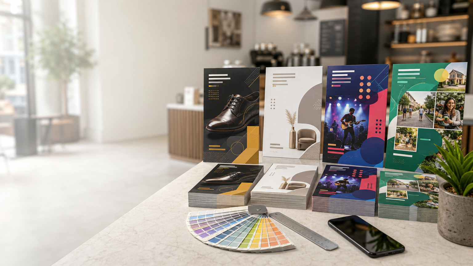
After an event or busy day, people may have spoken with many businesses. A visiting card can act as a physical memory cue. Recognizable colours, clear brand elements, thoughtful typography, and an appropriate material can make the card easier to identify later.
The objective is not to make the card unusual at any cost. It is to make it recognizably yours while keeping it practical. A restrained design that fits the business can be more memorable than a card filled with effects.
3. It Reinforces Brand Consistency
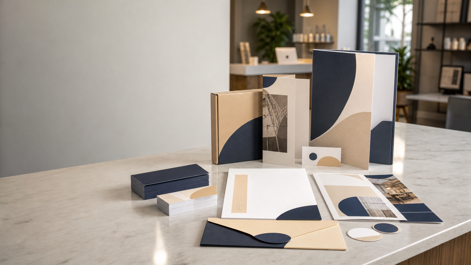
A visiting card should feel connected to the wider business identity. Colours, typography, visual style, and tone should align with the company's website, signage, stationery, brochures, packaging, or other customer-facing materials where relevant.
Consistency helps customers recognize that different touchpoints belong to the same business. A simple brand system applied carefully is usually more effective than decorative elements that have no relationship to the rest of the identity.
4. Information Hierarchy Makes Contact Easier
The primary job of a visiting card is to communicate useful information. A beautiful card that makes the phone number difficult to find is not doing its job well.
Start with essentials. Depending on the role and business, these may include the person's name, designation, business name, phone number, email address, website, and relevant address or digital contact. Not every card needs every possible detail. Include what helps the recipient take the next step.
Use visual hierarchy so the name and business identity are easy to notice while contact information remains readable. If the card feels crowded, remove low-priority information rather than shrinking everything.
5. Paper and Card Stock Influence the Experience
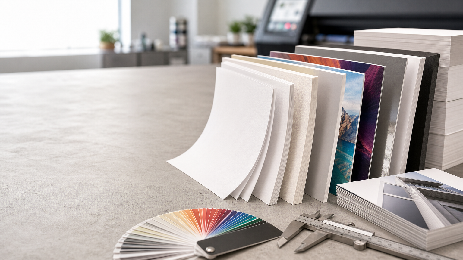
People experience a visiting card visually and physically. Paper weight, stiffness, texture, coating, and surface feel all influence its character. A sturdy card can feel substantial, while a textured or uncoated stock creates a different impression from a smooth coated surface.
There is no single material that is best for every business. A minimal professional identity may suit a clean matte stock, while another design may work well with a glossy or textured finish. The choice should support the design, expected handling, printing process, and desired feel.
Paper weight and actual thickness are not exactly the same. Two stocks with similar GSM can feel different because of their coating and construction, so physical samples can be more informative than choosing only from a number.
6. Finishing Works Best When It Has a Purpose
Finishing can make selected elements more noticeable or tactile. Depending on the production method and design, options may include matte or gloss lamination, spot effects, foil accents, embossing, rounded corners, or other treatments.
The strongest results usually come from restraint. A finish should support the brand or highlight an important element rather than being added simply because it is available. Practical use matters too. A surface that shows fingerprints easily, reduces readability, or prevents writing when notes are commonly added may not suit the card's purpose.
7. Use Both Sides Intelligently
A double-sided card can separate brand presentation from contact information. One side might focus on visual identity while the other organizes personal details and response options. This often creates a cleaner layout than forcing everything onto one side.
The second side should still have a purpose. Filling it with unnecessary slogans, icons, or decorative elements can reduce clarity. Treat both sides as one coordinated communication piece.
8. Connect Print and Digital with a QR Code
A QR code can lead to a website, portfolio, contact page, digital profile, catalogue, or enquiry page. It can make the transition from a physical introduction to an online action easier.
The code should not replace essential human-readable information. Keep important contact details visible and use the QR code as an additional path. Test it from the final production artwork at realistic printed size, confirm the destination, and provide enough clear space around the code for reliable scanning.
9. Readability Is More Important Than Decoration
Visiting cards are small, so very thin fonts, tiny text, weak contrast, complicated backgrounds, and excessive effects can quickly make information difficult to use. Review artwork at actual size rather than only while zoomed in on a monitor.
Check that phone numbers, email addresses, and website details can be read comfortably under normal lighting. If metallic, glossy, dark, or textured surfaces are involved, consider how reflections and contrast will affect legibility in real use.
10. Print Quality Protects the Design
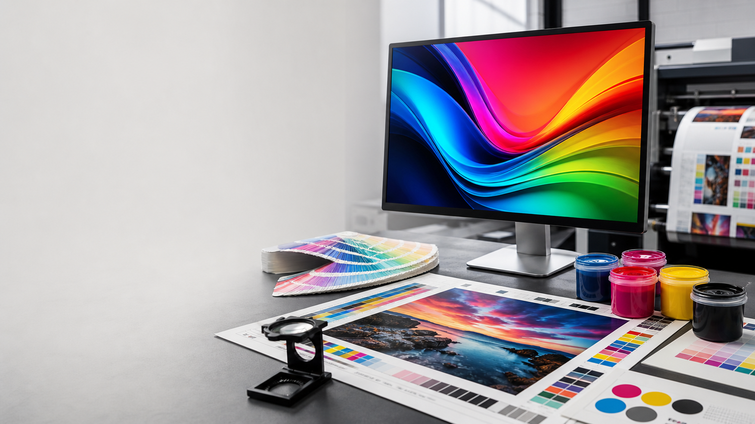
A strong design depends on accurate production. Sharp text, clean trimming, suitable colour reproduction, correct alignment, and consistent finishing contribute to the final impression. Low-resolution logos or images, insufficient margins, and unsuitable artwork can reduce quality before printing begins.
Use suitable source files and follow the required specifications for bleed, safe margins, colour setup, and export format. Fine lines, small reversed text, special finishes, and edge-sensitive elements should be appropriate for the selected production process.
Common Visiting Card Mistakes
Including too much information
A visiting card is not a brochure. Long service lists, multiple promotional messages, numerous social handles, and several calls to action can make it harder to use. Prioritize details that support a future conversation.
Using outdated details
Before printing, verify every phone number, email address, website, designation, spelling, and address. A polished card with incorrect information creates frustration and waste.
Choosing style over legibility
Decorative fonts, low-contrast colours, special effects, or complex backgrounds should never make essential details difficult to read. Design should support communication.
Ignoring margins and trim
Important text or graphics placed too close to the edge can look uncomfortable or be affected by normal production tolerances. Use appropriate safe margins and bleed for the print specification.
Practical Checklist Before Printing
- Confirm the purpose: Decide what the recipient should be able to do after receiving the card.
- Verify details: Check name, role, phone, email, website, address, and spelling.
- Keep hierarchy clear: Make essential information easy to scan.
- Review actual size: Confirm small text and fine elements remain readable.
- Stay on brand: Match colours, typography, and visual tone with the wider identity.
- Select suitable material: Consider feel, stiffness, coating, handling, and printing method.
- Use finishes deliberately: Choose effects that strengthen rather than overwhelm the design.
- Test QR codes: Scan the final artwork and confirm the destination.
- Prepare print-ready artwork: Follow required bleed, margin, colour, resolution, and export settings.
- Proof carefully: Check numbers, alignment, spelling, and final visual balance.
Make the Exchange Part of the Impression
The card works best when it supports a genuine interaction. Instead of handing cards out without context, exchange one after a useful conversation or when the other person has a reason to follow up. This connects the physical card with a real memory.
Keep cards accessible and in good condition. If appropriate, briefly point out the most useful contact method or digital link. These small habits make the exchange feel natural and prepared rather than mechanical.
Final Thoughts
A visiting card remains a practical branding tool because it combines identity, contact information, and a physical reminder in one compact piece. Its value comes not from being traditional, but from being useful at the moment two people meet.
A strong first impression depends on more than premium paper or special finishing. Clear information, readable design, consistent branding, suitable material, accurate printing, and thoughtful handling all matter. When these details are planned together, a visiting card can extend a short introduction into a professional connection that is easier to remember and easier to continue.