Quick summary
Understand the difference between CMYK and RGB, why screen and printed colours can look different, and how to choose the right colour mode when preparing artwork for professional printing.
Colour is one of the first things people notice in a printed design. A bright flyer, polished brochure, business card, product label, or poster can look excellent on a computer screen, yet the printed result may appear slightly different. One common reason is the difference between RGB and CMYK colour modes.
RGB is designed primarily for light-emitting screens, while CMYK is the standard colour model used for many full-colour printing processes. Understanding how these systems work helps you prepare artwork more realistically, reduce unexpected colour shifts, and communicate more effectively when sending a design for print.
What Is RGB Colour Mode?
RGB stands for Red, Green, and Blue. It is an additive colour model used by devices that create colour with light, including monitors, smartphones, televisions, cameras, and digital displays. Different intensities of red, green, and blue light combine to create a broad range of colours. Because screens emit light directly, RGB can display some very bright and vivid colours that ordinary CMYK printing cannot reproduce exactly.
Where RGB is normally used
RGB is generally appropriate for websites, social media graphics, online advertisements, presentations, email graphics, digital photographs, and other designs intended mainly for electronic displays. If a design will exist only on a screen, there is usually no reason to convert it to CMYK simply because CMYK is associated with professional design. The intended output should determine the colour mode.
What Is CMYK Colour Mode?
CMYK stands for Cyan, Magenta, Yellow, and Key, with Key normally referring to black. It is a subtractive colour model commonly used in commercial colour printing. Instead of producing colour with emitted light, CMYK printing places inks, toners, or other colourants on a physical surface. These colours absorb and reflect portions of the light falling on the material.
By combining cyan, magenta, yellow, and black in different proportions, a printing process can reproduce photographs, illustrations, coloured backgrounds, and many other design elements. Black is included separately because it improves dark tones, text, detail, and practical reproduction compared with trying to create every dark area only from cyan, magenta, and yellow.
Why RGB and CMYK Can Look Different
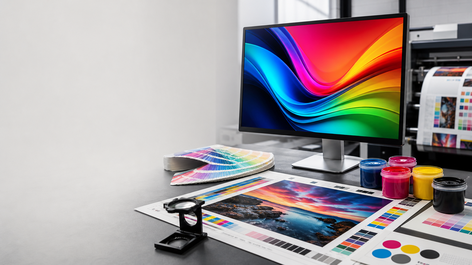
A screen and a printed sheet create colour in fundamentally different ways. A screen emits light, while printed material reflects surrounding light. Their available colour ranges are therefore not identical. Some highly saturated blues, greens, reds, and neon-like colours that look intense in RGB may fall outside the reproducible range of a standard CMYK process.
When those colours are converted to CMYK, software maps them to printable alternatives. The result can appear less luminous or slightly different in hue. This does not mean CMYK printing is poor quality. It means physical output has different colour capabilities from a backlit display. Good print preparation begins with understanding that a screen is not a perfect physical proof.
Which Colour Mode Should You Use for Print?
For artwork intended for standard full-colour printing, CMYK is generally the appropriate working or final output colour space when the printer's workflow calls for it. Preparing artwork with print output in mind allows you to review possible colour changes before production rather than discovering them only after printing.
However, the correct setup can depend on software, print process, file standard, and production workflow. Some modern workflows can accept RGB images and perform controlled colour conversion later. Follow the specifications supplied for the particular print job rather than applying one rule blindly to every file.
When Should You Convert RGB Artwork to CMYK?
If artwork was created in RGB and the final production file is required in CMYK, convert it before final approval so you can inspect the result. Pay particular attention to vivid backgrounds, gradients, photographs, brand colours, deep shadows, and brightly saturated graphics. If an important colour changes noticeably, you may need to adjust the values or choose a more printable alternative.
Keep an editable master copy before conversion. This makes it easier to create separate versions for digital and print use without repeatedly converting the same file back and forth.
Avoid Repeated RGB-CMYK Conversions
Repeatedly converting artwork between colour spaces is not a good workflow. Each conversion may reinterpret colour values, especially when different colour profiles or software settings are involved. Maintain a clean master file, decide the intended output, and create appropriate export versions from that source. A campaign can have an RGB version for social media and a print-prepared version for a flyer while sharing the same design.
What Are Colour Profiles?
A colour mode tells you the basic model, but a colour profile provides more specific information about how colour values should be interpreted. RGB and CMYK each have multiple profiles designed for different devices, standards, papers, inks, and printing conditions.
This is why simply clicking convert to CMYK is not always the complete answer. The destination profile can influence the conversion. If a printer provides a recommended profile or PDF export specification, use that guidance. If no special specification is provided, avoid guessing at unusual settings and keep the original artwork available.
How Paper and Finish Affect Printed Colour
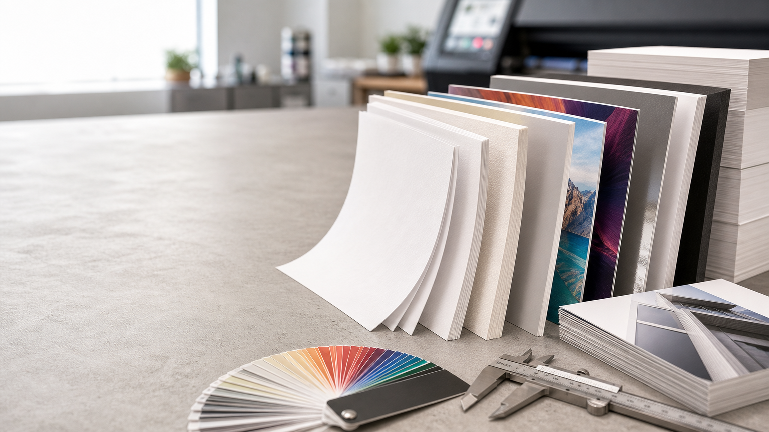
Colour mode is only one factor in the final appearance. Paper surface, coating, whiteness, texture, ink behaviour, lamination, and lighting can all change how a printed colour is perceived. A glossy coated stock may make photographs and dark colours appear different from an uncoated textured paper. Matte surfaces can create a softer appearance, while lamination or other finishes may influence contrast and saturation.
Two prints made from the same digital colour values can therefore look different on different materials. When visual matching matters, evaluating a suitable physical proof or sample is more useful than relying only on a screen.
Screen Brightness Can Mislead You
Modern displays are often bright and high-contrast. A design viewed on a luminous screen may appear more vibrant than the same design printed on paper under normal room lighting. Different phones, laptops, and monitors can also display the same RGB file differently. A screen preview is useful for design, but it is not an absolute reference for physical colour.
What About Brand Colours?
Brand colours deserve extra attention because consistency matters across business cards, brochures, packaging, signage, stationery, and digital media. A brand colour selected only because it looks striking in RGB may be difficult to reproduce consistently in standard CMYK printing.
When developing a brand identity, it is useful to define suitable values for both digital and print applications. The RGB version can be optimized for screens, while a practical CMYK interpretation can be established for printed materials. Some projects may use special spot colours or other production methods when a particular colour is critical, but those requirements should be discussed as part of the specific printing process.
Common CMYK and RGB Mistakes to Avoid
Sending vivid RGB artwork without checking conversion
If your design relies on intense screen colours, review how they translate to the intended print workflow before production, especially saturated blues, greens, and bright effects.
Assuming CMYK values guarantee identical output everywhere
The same CMYK percentages can look different depending on printing conditions, material, finishing, calibration, and viewing light. CMYK is a production colour model, not a promise that every device and paper will produce an identical appearance.
Using screenshots as print artwork
A screenshot may have unsuitable resolution, colour handling, and image quality for professional print. Whenever possible, use the original design file, high-resolution image, or properly exported artwork.
Ignoring black text and fine details
Small black text and fine line work need careful file preparation. Complex multi-colour blacks can create registration or reproduction issues in delicate elements. Follow production specifications for how black should be built in your particular job.
Forgetting to proof after conversion
After converting or exporting, reopen the final file and inspect it. Check colours, photographs, gradients, transparency, small text, and any elements that may have changed during export.
A Practical Print-Ready Colour Checklist
- Confirm the final medium: Decide whether the design is for print, digital use, or both.
- Keep an editable master: Preserve the original design before colour conversion or flattening.
- Follow print specifications: Use the requested colour mode, profile, and PDF settings when supplied.
- Review saturated colours: Check bright RGB colours after conversion to the intended print space.
- Use quality source images: Avoid screenshots and low-resolution graphics for important print work.
- Consider the material: Remember that coated, uncoated, textured, and finished surfaces affect appearance.
- Check the exported file: Inspect the actual production PDF rather than only the working document.
- Use physical evaluation when needed: For colour-critical work, a suitable proof or sample can provide more useful guidance than a monitor alone.
RGB for Digital, CMYK for Print: A Useful Rule with Context
RGB for screens and CMYK for print is a useful starting rule because it reflects how the two media create colour. But professional file preparation is more nuanced. A print workflow may specify a particular CMYK profile, accept tagged RGB images, or handle conversion at a later production stage.
The most reliable approach is to design with the final output in mind and follow the requirements for the job. If the same creative work will be used both online and in print, prepare separate output files rather than forcing one file to serve every medium.
Final Thoughts
RGB and CMYK are not competing choices where one is universally better. They are colour systems designed for different ways of displaying an image. RGB takes advantage of emitted light on digital screens, while CMYK is built around physical colour reproduction in many printing processes.
For print projects, understanding the difference helps you anticipate colour shifts, choose practical brand colours, review artwork before production, and set realistic expectations for the finished piece. Keep your original file, prepare the correct output version, inspect colour after conversion, and consider paper and finishing as part of the result. A thoughtful colour workflow makes the journey from screen to print far more predictable.