Quick summary
Discover modern business card design ideas for professionals, including minimalist layouts, QR code cards, foil finishes, spot UV, premium textures, and branding tips.
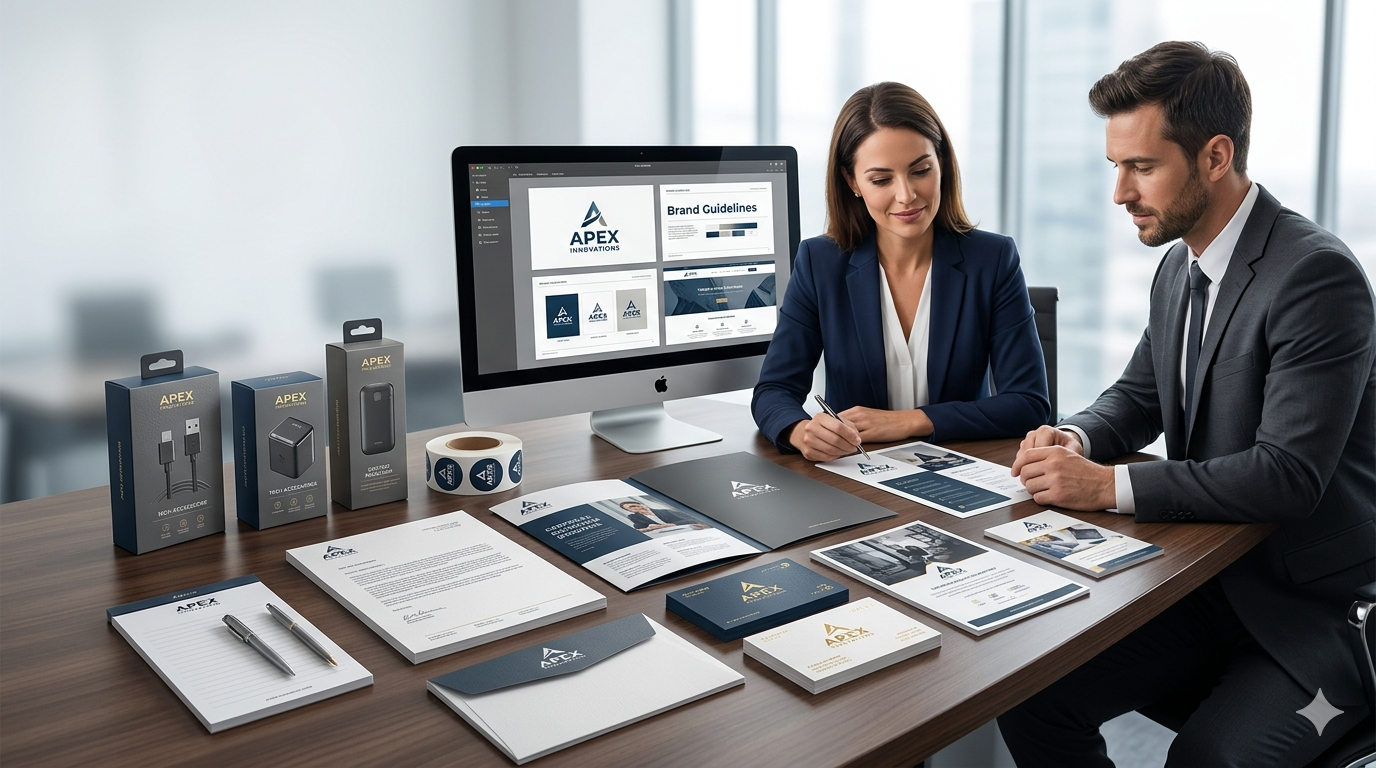
A business card is still one of the most useful tools for professional networking. Even today, when most communication happens online, a well-designed business card can create a strong first impression and help people remember your brand.
The difference is that modern business cards are no longer just about adding your name, company, and phone number. Professionals now want cards that look smart, feel premium, and match their brand identity. A good card should be easy to read, visually clean, and memorable without feeling crowded.
At Sanavi Print Point, many customers look for business card printing that feels both modern and professional. The right design choice can make a small card work like a strong branding tool.
Why Modern Business Card Design Matters
People often judge a brand within seconds. A business card may be small, but it says a lot about how seriously you take your business. A well-designed card helps you look more polished, trustworthy, and prepared.
Modern business card design is important because it helps you:
- create a strong first impression
- show your brand personality
- make contact details easy to remember
- stand out from plain generic cards
- support a premium business image
If you want to upgrade your brand presentation, you can explore printing support and card options at Sanavi Print Point.
What Makes a Business Card Look Modern
A modern business card usually looks clean rather than overloaded. It focuses on balance, readability, and finishing quality. Instead of using too many colors, shapes, or effects, it uses fewer elements more effectively.
Most modern visiting card designs include:
- simple layout
- readable typography
- good spacing
- brand-focused colors
- quality printing finish
- clear information hierarchy
The goal is not to make the card busy. The goal is to make it memorable and professional.
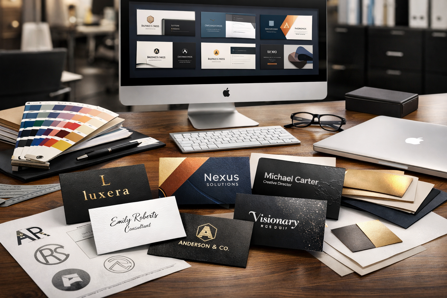
1. Minimalist Business Card Design
Minimalist business cards remain one of the best choices for professionals. They use white space, clean alignment, and limited colors to create a refined look. This style works especially well for consultants, architects, lawyers, finance professionals, and premium service brands.
Why it works
Minimalist cards feel elegant and serious. They do not distract the viewer with unnecessary graphics. Instead, they let your name, logo, and contact details stand out clearly.
2. Typography Focused Layouts
Typography can be the main design feature of a card. A strong font choice, clean hierarchy, and proper spacing can make even a simple card look premium.
Best use
This style works well for agencies, creative professionals, consultants, and personal brands that want a clean but confident identity.
Your name or brand name can be slightly more prominent, while the rest of the details remain smaller but readable. The card should always feel easy to scan in one glance.
3. Matte Finish for a Premium Look
Finish plays a major role in how a business card feels. Matte finish is one of the most popular choices for modern professional business cards because it gives a soft, elegant appearance and reduces glare.
Matte finish business cards often look more refined than glossy ones, especially when paired with a clean design and strong typography.
4. Spot UV for Highlighted Details
Spot UV is a great way to add a premium touch without making the design feel too flashy. It highlights selected parts of the card, such as the logo or brand name, with a glossy effect while the rest of the card stays matte.
Good areas to highlight
- logo
- brand name
- small design pattern
- important visual detail
This makes the card feel more luxurious while still keeping the overall design professional.
5. Foil Elements for Elegant Branding
Foil business cards are a strong option for professionals who want a high-end image. Gold, silver, or rose gold foil can add elegance when used carefully. Foil works especially well for luxury brands, boutique businesses, interior designers, salons, and premium consultants.
The key is to keep it controlled. A little foil can look classy. Too much can make the card feel heavy.
6. QR Code Business Cards
A modern business card should also support digital convenience. Adding a QR code can make it easier for people to save your contact details, open your website, check your portfolio, or message you directly.
A QR code can link to:
- your website
- contact page
- portfolio
- Google Maps location
- social profile
If you are using a QR code, make sure it is clear, large enough to scan, and tested before printing.
7. Double Sided Business Card Design
Double sided business cards are often a better choice than single sided ones because they give you more space without making the layout look crowded. One side can hold contact details, while the other can show branding, services, or a QR code.
A practical layout idea
Use the front side for name, designation, logo, phone number, and email. Use the back side for your website, service highlights, address, QR code, or brand pattern.
This helps the card stay clean while still being informative.
8. Thick Card Stock and Premium Texture
People notice how a card feels almost immediately. Thick card stock gives a stronger impression of quality and durability. Textured finishes or specialty materials can also improve the overall feel when used in the right way.
A premium card stock often makes a bigger impact than adding too many design effects. It shows attention to detail and gives the card a more valuable presence.
9. Industry Specific Design Style
Not every business card should look the same. A modern card should fit the profession it represents.
Examples
Corporate professionals: clean layout, neutral colors, and minimal design.
Creative professionals: stronger visual identity, bolder color accents, and modern layout choices.
Healthcare professionals: simple structure, trust-building colors, and clear readability.
Retail or local businesses: practical design, strong branding, and visible contact details.
When the design matches the profession, the card feels more relevant and more effective.
Common Mistakes That Make Business Cards Look Outdated
Even a good concept can fail if the design is not executed properly. Some common mistakes include:
- too much information
- poor font choice
- weak spacing
- too many colors
- low quality logo files
- too many decorative effects
A modern professional business card should feel clear and intentional. If too many things compete for attention, the card quickly starts looking outdated.
How to Choose the Right Business Card Design
Before finalizing a design, think about the impression you want to create. Do you want to look premium, creative, trustworthy, or bold? Your answer should guide the card style.
You should also think about who will receive the card and where you will use it. A business card used in exhibitions may need stronger brand visibility, while a card for corporate meetings may need a more minimal and formal look.
The best business card design is the one that reflects your business clearly and professionally.
Printing Quality Matters Too
Even the best design can lose its impact if the print quality is poor. Sharp text, correct colors, proper alignment, and the right finish all matter. A premium card is not only designed well. It is also printed well.
For business card printing that supports both design quality and finishing quality, visit Sanavi Print Point.
Final Thoughts
Modern business card design is about clarity, style, and brand relevance. A professional card should look clean, feel premium, and make it easy for people to remember and contact you.
Whether you prefer a minimalist card, foil highlights, QR code integration, matte finish, or thick premium stock, the best result usually comes from balancing simplicity with smart design choices.
If you are planning to print modern visiting cards for your brand, start with a design that reflects your business properly and supports long-term brand value.
To explore card printing and business stationery solutions, visit https://www.sanaviprintpoint.com.
FAQ
What is the best business card design for professionals?
The best business card design for professionals is usually clean, readable, and aligned with the brand. Minimalist layouts, strong typography, and premium finishes often work very well.
Are minimalist business cards still popular?
Yes, minimalist business cards are still popular because they look modern, premium, and professional across many industries.
Should I add a QR code to my business card?
A QR code is useful if it links to something practical like your website, contact page, portfolio, WhatsApp, or location.
Which finish is better for business cards, matte or glossy?
Matte finish is often preferred for modern professional cards because it looks elegant and reduces glare. Glossy can also work depending on the design style.
Is a double sided business card better than a single sided one?
Yes, in many cases a double sided business card is better because it gives you more space for branding and information without making the layout crowded.
How do I make my business card look premium?
Use a clean layout, readable fonts, strong card stock, proper spacing, and finishing options like matte lamination, spot UV, or foil where suitable.